Why images look AI-made at a glance: cues and their limits
TL;DR
- Most cues raised in the thread (broken kanji, typefaces that differ from part to part, the color cast, overcrowded layout) fall under two research categories: "functional implausibilities" and "stylistic artifacts"
- In an experiment with 50,444 participants, people correctly identified AI images 72% of the time at a 1-second display and 82% at 20 seconds. Oddities in text and objects become easier to find the longer people look
- Another study limited to face images found accuracy below 50% in some cases
- In a study of text detection, a majority vote of five people who regularly use LLMs for writing got only 1 of 300 articles wrong. Their cues were specific vocabulary and sentence patterns; difficult words and a neutral tone were not signs of AI
- A visual sense that something is off is a reason to start checking. Check the origin with C2PA provenance data or SynthID watermarks. The absence of a record or a watermark is not proof that a human made it
Contents (6)
On October 21, a post on X about an image styled like a beer shop sign (the kind of handmade point-of-purchase card Japanese stores put next to products) was compiled on Togetter, a Japanese service that collects X posts into curated threads, and drew wide attention. The poster said they sensed “this is AI” within a second, before looking at any details, and asked what exactly we are reacting to when something feels AI-made. The replies list concrete cues: mismatched typefaces, broken kanji, and an overall yellowish tint.
How does research classify these cues, and how far can they be trusted? I look at papers on telling AI images and text apart from human work, and at the official documentation for systems that verify where content came from.
Cues raised in the thread
The most common replies were about the lettering. People pointed out that the typeface shifts subtly from one part of the sign to another, that some characters are smaller than the rest, and that the kanji 冷 (“cold”) is malformed. Others said the sign looks hand-drawn yet is too uniform and too neat.
Color and layout also came up often: an overall yellow or orange cast, a layout that crams in information as if afraid of empty space, and a flatness that leaves no clear focal point.
Some replies pointed to a mismatch in skill. Someone who can draw this well would be unlikely to produce a design that is inconsistent in places. Another view was that human designers don’t cut corners on details, so the inconsistency stands out.
Mapping the cues to research categories
In June 2024, Kamali and colleagues at Northwestern University published a guide to identifying AI-generated images. Using 138 images generated by diffusion models, 9 collected from social media, and 42 real photographs, they sort the cues into five categories.
| Category | Main examples |
|---|---|
| Anatomical implausibilities | Hands, eyes, teeth, merged bodies |
| Stylistic artifacts | Waxy skin, cinematic staged scenes, resolution or color that doesn’t match from part to part |
| Functional implausibilities | Unreadable text or logos, objects with unusable shapes, prompt words overrepresented in the image |
| Violations of physics | Inconsistent shadows, reflections, perspective |
| Sociocultural implausibilities | Unlikely scenarios, depictions that contradict cultural norms or history |
Most of the thread’s cues fall into two of these categories. The broken kanji belongs to the text and logo item under “functional implausibilities.” According to the guide, AI-generated text may look like letters but belong to no existing language, or be misspelled. The typefaces that don’t match across the sign seem close to the “stylistic artifacts” item about style or resolution not matching from part to part.
The guide attaches caveats to every cue, though. Professional photos are also polished or color-graded to look cinematic, so such a look alone doesn’t make an image AI. One odd spot is not conclusive evidence, and the guide advises looking for multiple cues. On the yellowish tint raised in the thread, I could not find official material from any generation service explaining a color bias.
Why text breaks easily
Text inside images has long been a weak point for generative AI. A 2022 paper by Google researchers traced one cause to the design of the component that reads the prompt (the text encoder). Widely used encoders don’t receive words as sequences of characters, so the model struggles to predict which letters to draw in what order when rendering a word. Models that switched to a character-level encoder spelled rare words more accurately than the other models compared, by more than 30 percentage points.
Scripts with intricate character shapes, such as kanji, are considered even harder. GlyphDraw, a paper on a method for drawing Chinese characters in images, lists existing image models’ inability to render text well as a major limitation and says it is especially visible with complex glyphs like Chinese characters. The malformed 冷 on the sign seems to fit this pattern.
Text cues are getting weaker, however. Kamali’s guide includes an example of a sweatshirt with a university name drawn by three models. In Stable Diffusion XL the lettering was broken, but in Midjourney V6 the spelling was correct, and the remaining cue was instead “a typeface unusual for a sweatshirt.” The guide notes that text rendering is improving rapidly and that problems may not be noticeable at a glance.
How accurate is a one-second judgment?
At CHI 2025, the same research group presented results from a large experiment. 50,444 people viewed and judged 450 AI-generated images and 149 real photographs, for a total of 749,828 observations. Display time was randomly assigned, ranging from 1 second to unlimited.
At 1 second, people correctly identified AI images 72% of the time. That rose to 77% at 5 seconds, 80% at 10 seconds, and 82% at 20 seconds. At 1 second, 43% of the AI images were identified at below-chance accuracy; at 20 seconds, this fell to 17%.
The type of cue also made a difference. Anatomical implausibilities and stylistic artifacts were often noticeable at a glance, and improved by 11% from 1 second to unlimited time. Functional implausibilities improved by 18%, the largest gain. According to the paper, oddities in text and in how objects are built are found when people look closely and know the depicted object well. What the thread’s poster sensed in one second may have been the overall stylistic mismatch rather than the lettering itself.
The images in this experiment were photorealistic, not illustrations like a shop sign. Still, the finding that quick judgments work for some images and fail for others is useful.
In other studies limited to face images, visual judgment fared poorly. In Frank et al.’s study, 3,002 people in the United States, Germany, and China judged audio, images, and text in 2022. The images were faces made with StyleGAN2, and accuracy was 48.58% in the US, 45.90% in Germany, and 49.93% in China, below 50% in all three countries. Many participants tended to answer that what they saw was made by a human. In Nightingale and Farid’s study, also limited to face photos, accuracy was 48.2%. Even when participants were taught how to spot fakes and given feedback after every answer, accuracy only reached 59.0%.
The images people notice right away are also the ones likely to go viral. Images nobody noticed don’t get discussed as “AI-looking,” so it seems wise to discount that bias when reading threads like this.
Text “AI-ness” has similar cues
Researchers have asked the same question about text. In a 2025 paper, Russell and colleagues had people read 300 English nonfiction articles and judge whether a human or an AI wrote each one. The AIs were GPT-4o, Claude, and o1.
A majority vote of five people who use LLMs for writing every day got only 1 of the 300 articles wrong. Accuracy barely dropped even for articles that had been paraphrased or processed to “look human.” In contrast, the judgments of four people who don’t use LLMs, or use them only for tasks other than writing, were close to chance. They identified AI articles 56.7% of the time and labeled human articles as AI 52.5% of the time.
The most common cue in their explanations was vocabulary, appearing in 53.1% of them. Next was sentence structure (35.9%), with examples such as heavy use of “not only… but also” and always listing things in threes. Inexperienced judges assumed text was AI just because it contained difficult words, or treated a neutral tone as a sign of AI, which increased their errors. The experienced judges reportedly knew that human writing contains more grammatical errors, and knew the specific words AI overuses.
There are efforts in Japanese, too, to collect the words and structures common in AI text. According to the description of yomiyasu, a skill for fixing AI-written Japanese, banning words like 手触り (tezawari, “feel”), 解像度 (kaizōdo, “resolution,” used figuratively), and 泥臭い (dorokusai, “gritty”) just led to them being replaced by other vague words. So yomiyasu publishes principles for fixing sentence structure before vocabulary. The image thread also had replies saying the creator had used the default color tone, which a prompt could change. What skilled spotters remember may be the habits generative AI shows when not told otherwise.
Check provenance, not appearance
Because visual judgment is hit or miss, systems for verifying where content came from are being built.
The first is Content Credentials, defined by C2PA (the Coalition for Content Provenance and Authenticity). It attaches a record of where an image or video was made and how it was edited, with a signature that makes tampering detectable. C2PA’s explainer acknowledges that this record can be stripped. For that reason, the specification also includes a way to recover stripped records from the cloud using invisible watermarks or fingerprint matching. The explainer’s position is that a provenance record alone does not tell you whether the content is true.
The second is Google DeepMind’s digital watermark SynthID. It embeds a watermark imperceptible to people in generated images, audio, text, and video. The image watermark is designed to survive cropping, filters, and compression. The SynthID Detector verification tool is now available to everyone. Google says it can check images, video, and audio made with AI from Google and its partners (OpenAI, NVIDIA, Kakao, and others).
Text watermarks become harder to detect after rewriting or in short passages. I covered those numbers in my article on OpenAI’s text watermark. Under any scheme, the absence of a record or watermark is not proof that a human made something.
A sense of wrongness in the first second is useful as a reason to start checking. But judging by the research numbers, treating the absence of that feeling as evidence of authenticity seems risky. When in doubt, don’t decide by appearance; check the provenance record or run a watermark detector.
Related notes
AI
OpenAI textGrain: ChatGPT and Codex text watermarks in the EU
To comply with the EU AI Act, OpenAI will embed an invisible watermark (textGrain) in EU ChatGPT and Codex text. How it works, where detection falls short, and uses for companies.
6 min
SecurityAI
GitHub Universe 2026 security features: plans and costs
I checked the GitHub Universe 2026 security launches in the official changelog and docs: npm package firewall, Dependabot reachability, AI Scan, and more. Plans, costs, and limits.
9 min
AutomationAI
Can Lightpanda 1.0 replace headless Chrome?
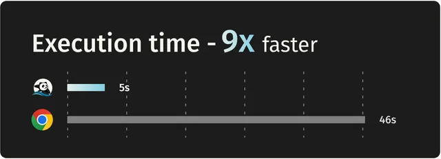
Lightpanda, a headless browser built in Zig, hit 1.0. With no rendering, official tests show 9x Chrome's speed at 1/16 the memory, but screenshots and layout don't carry over.
8 min